Learn the Lingo
case study designed and made by me, Mark Nouneh
- Role: Product Designer
- Timeline: Oct 2024 - Aug 2025 (10 months)
- Team Size: 1
- Business Model: EdTech
- Tools: Figma, SwiftUI, Maze
- Purpose: Design a language-learning app that feels fun and engaging, rather than repetitive or academic.
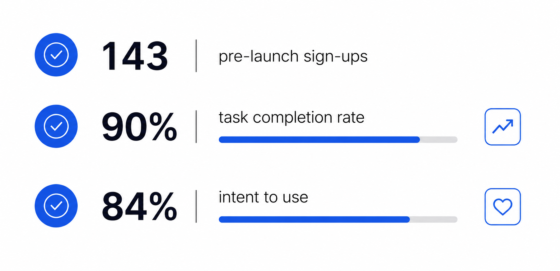
Key Metrics (pre launch)
Why Language Learning
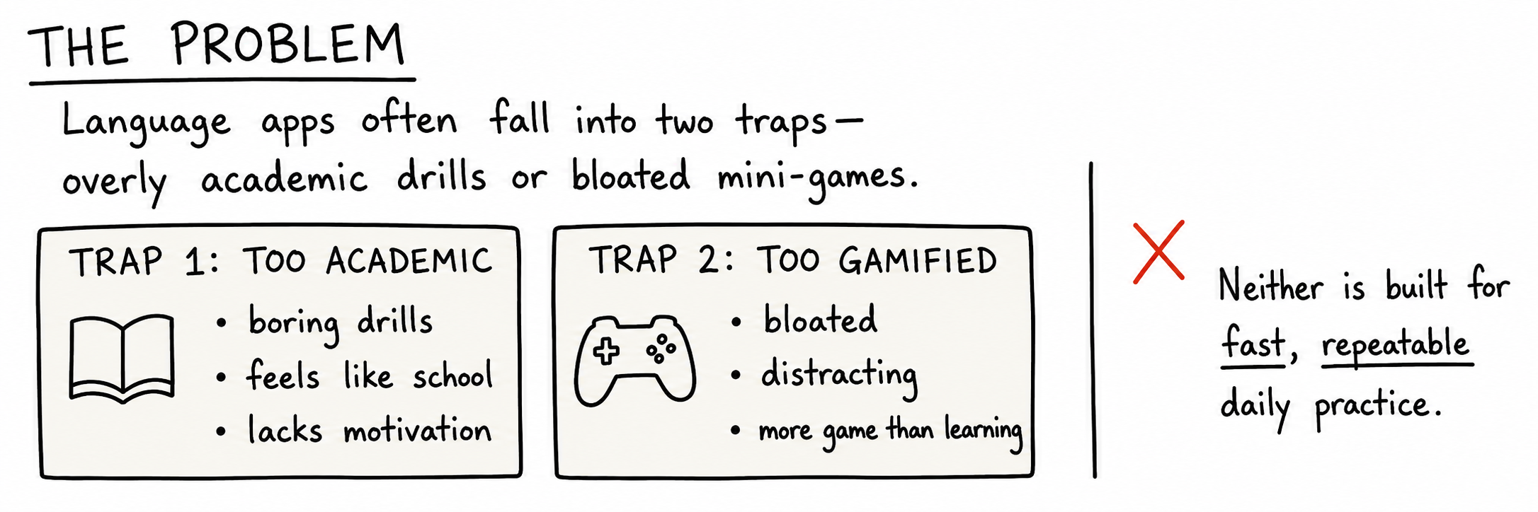
Step 1: Defining a problem
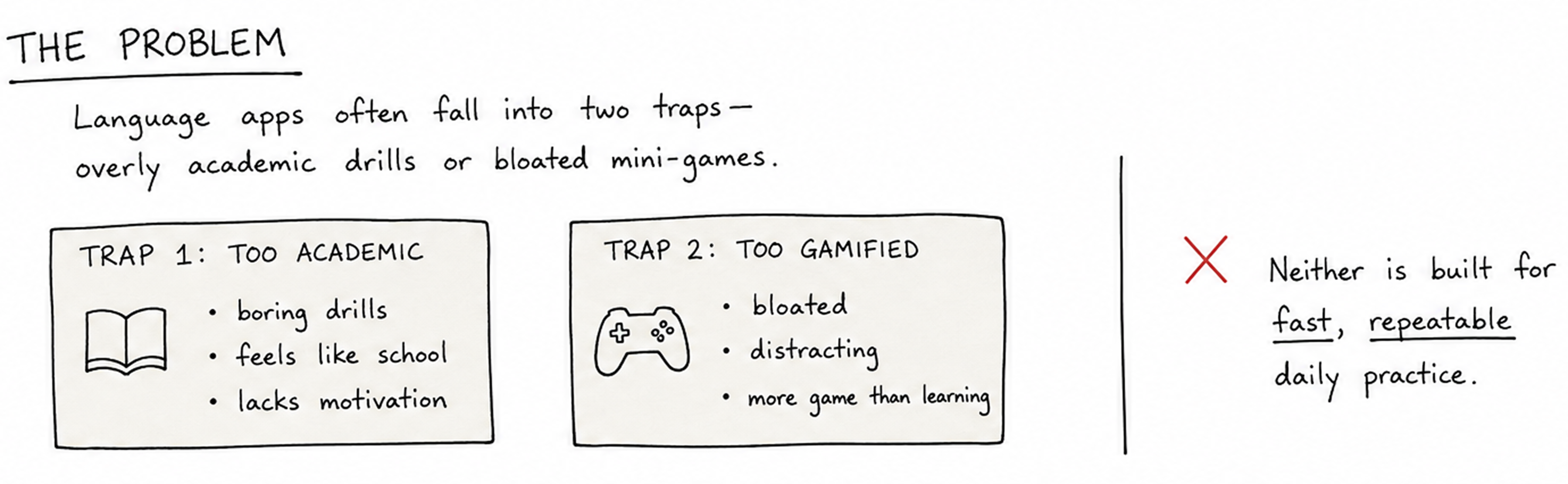
Research and Market Trends
User Persona:
Name: Maya Chen
Age: 24
User Type: Multilingual learner with a short-term goal
Goal: Improve language skills through quick, engaging practice sessions during commutes or short breaks.
Motivation: Visible progress, fast feedback, streaks, and light competition.
Pain Points: Loses interest when apps feel repetitive, cluttered, or slow.
Needs: Short sessions, distraction-free UI, measurable progress, and gamified repetition.
Quote: “I want practice to feel quick, fun, and like I’m improving every time.”
Current Market:
- Duolingo → 130M monthly users: Duolingo’s scale suggests broad demand for accessible, gamified language learning.
- MonkeyType → 30M monthly users: strong demand for fast-paced skill training
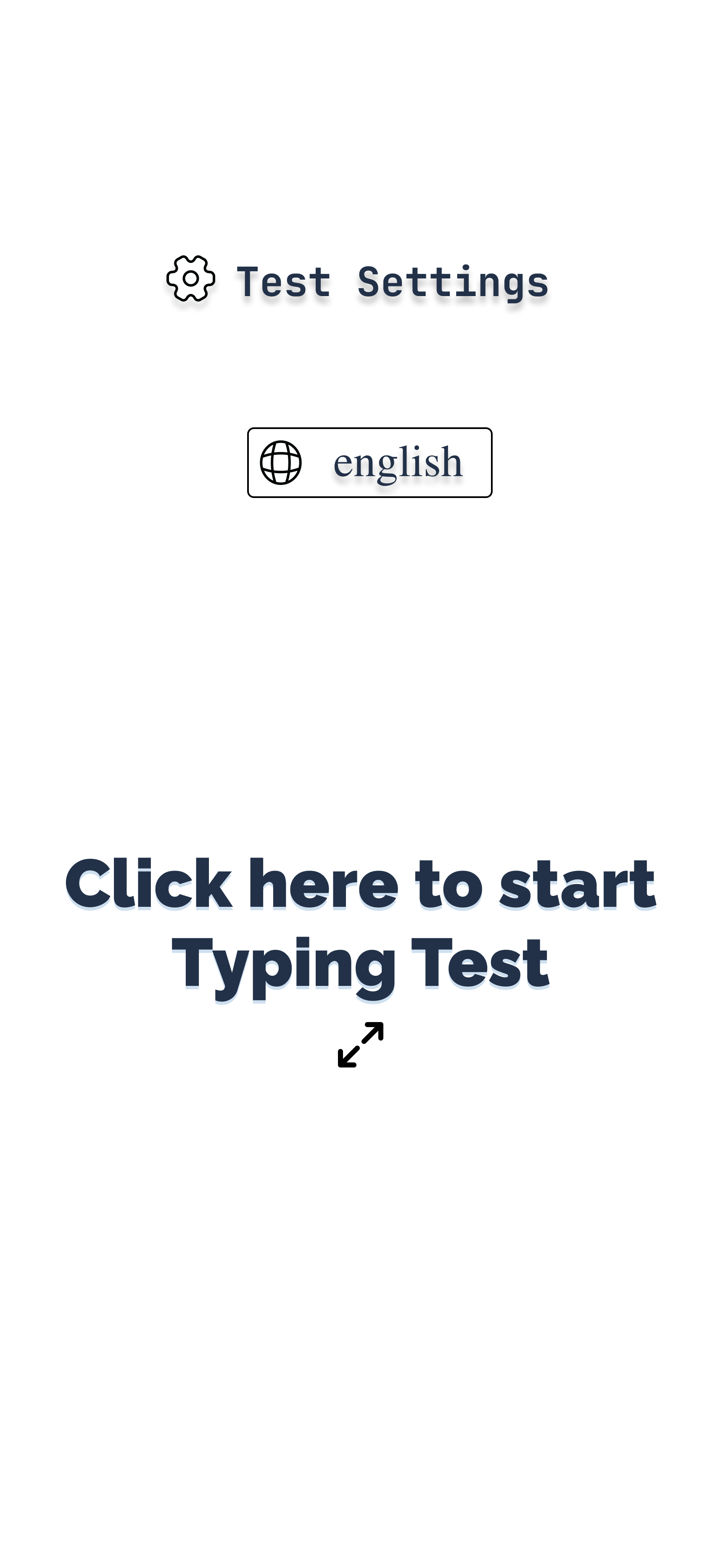
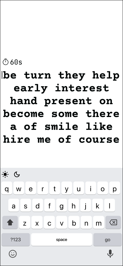
Current iPhone typing app
.png)
User Survey:
View survey hereMethodology: I surveyed 30 multilingual learners between the ages of 14 and 75, including students, professionals, and immigrants. The research explored their learning goals, mobile habits, motivations, frustrations, and reactions to gamified practice.
Quantitative Findings
- Repetition Churn: 25 / 30 participants abandoned language apps due to repetitive or mechanical daily exercises (Q12, Q13).
- Visual Distraction: 22 / 30 participants disengaged when interfaces became overwhelmed by excessive menus, ads, or pop-ups (Q15, Q16).
- Micro-Session Demand: 26 / 30 participants preferred 3–5 minute high-feedback challenges over traditional 15-minute lessons (Q20, Q22).
- Progress Importance: 27 / 30 participants ranked measurable progress as "Very" or "Extremely" important, yet standard streaks/XP failed to satisfy them (Q11, Q17).
- Device Switching: 18 / 30 participants regularly switch between mobile and desktop devices throughout the day (Q8, Q9).
Qualitative Finding
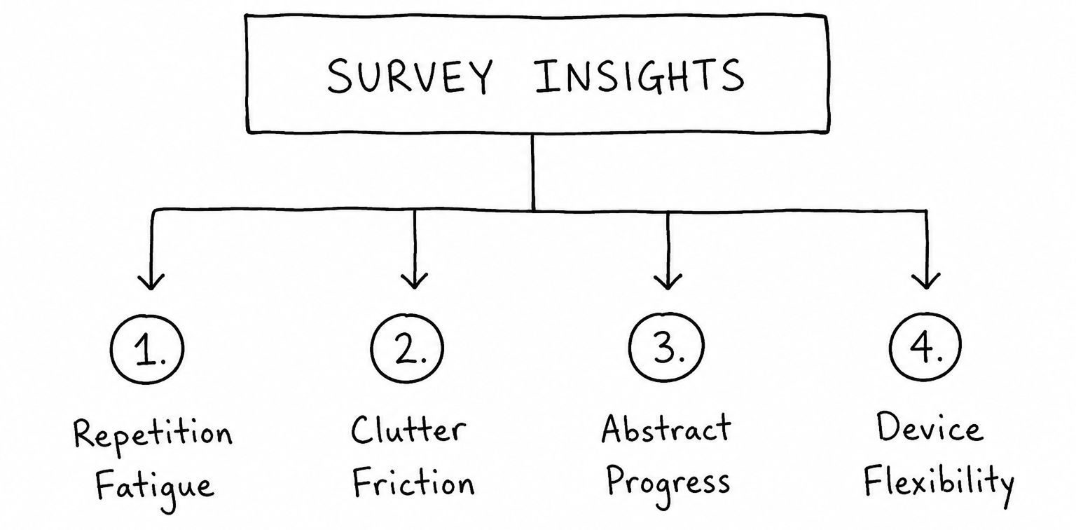
- Repetition Fatigue: Predictable formats and rigid drills convert language practice from an engaging challenge into a passive, uninspiring chore (Q14).
- Flow-Breaking Interfaces: Over-gamified surfaces and cluttered UIs pull focus away from learning and disrupt deep concentration.
- Habitual Micro-Practices: Learners fit study sessions into tight micro-windows (commutes, quick breaks) and rely on immediate feedback loops to feel accomplished (Q6, Q7).
- Cross-Platform Expectations: Core interaction mechanics must feel seamless whether using a touch interface on mobile or a physical keyboard on desktop.
User Needs:
- Learning sessions that fit short time windows
- Progress to feel visible and immediate
- Repetition to feel engaging instead of mechanical
- Light competition to stay consistent
- Distraction-free interfaces to stay in flow
Synthesis: There is high demand and strong expectations for mobile learning tools, yet the market for gamified language learning is limited and dominated by only a few major players. This creates a clear opportunity for a focused, fast-paced, engagement-driven learning experience.
Step 2: Designing a concept
Core Challenge
Based on the findings, I reframed the design challenge:
How might we make language learning as rewarding and measurable as leveling up in a game, something users return to for both the fun and the progress?
Using a typing test tool is practical, convenient, and aligns with user habits. This direction also connected to my personal experience using MonkeyType to strengthen my French and Spanish vocabulary through consistent, gamified repetition.
First idea
Step 3: Modification from the user research
Finding → Response
User research session with prototype walkthrough concluded
- Finding: Users could not see the unique value of a generic typing test app. Design Response: Retro visuals + simple flows that feel energizing, not overwhelming.
- Finding: Gamification in Duolingo was motivating. Design Response: Integrated progress tracking, rewards, and playful elements.
- Finding: Many struggle to find effective language learning tools. Design Response: Clear value upfront and easy-to-understand purpose.
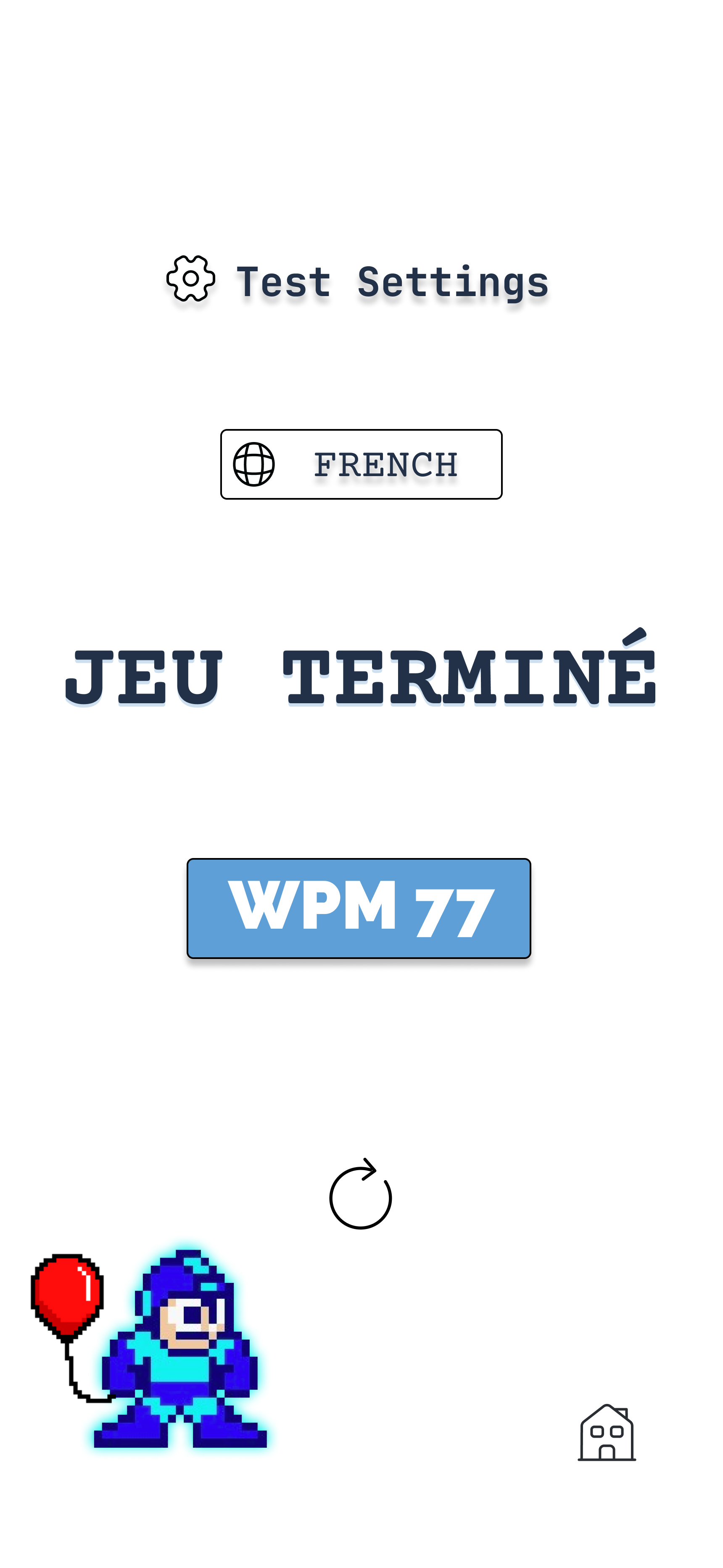
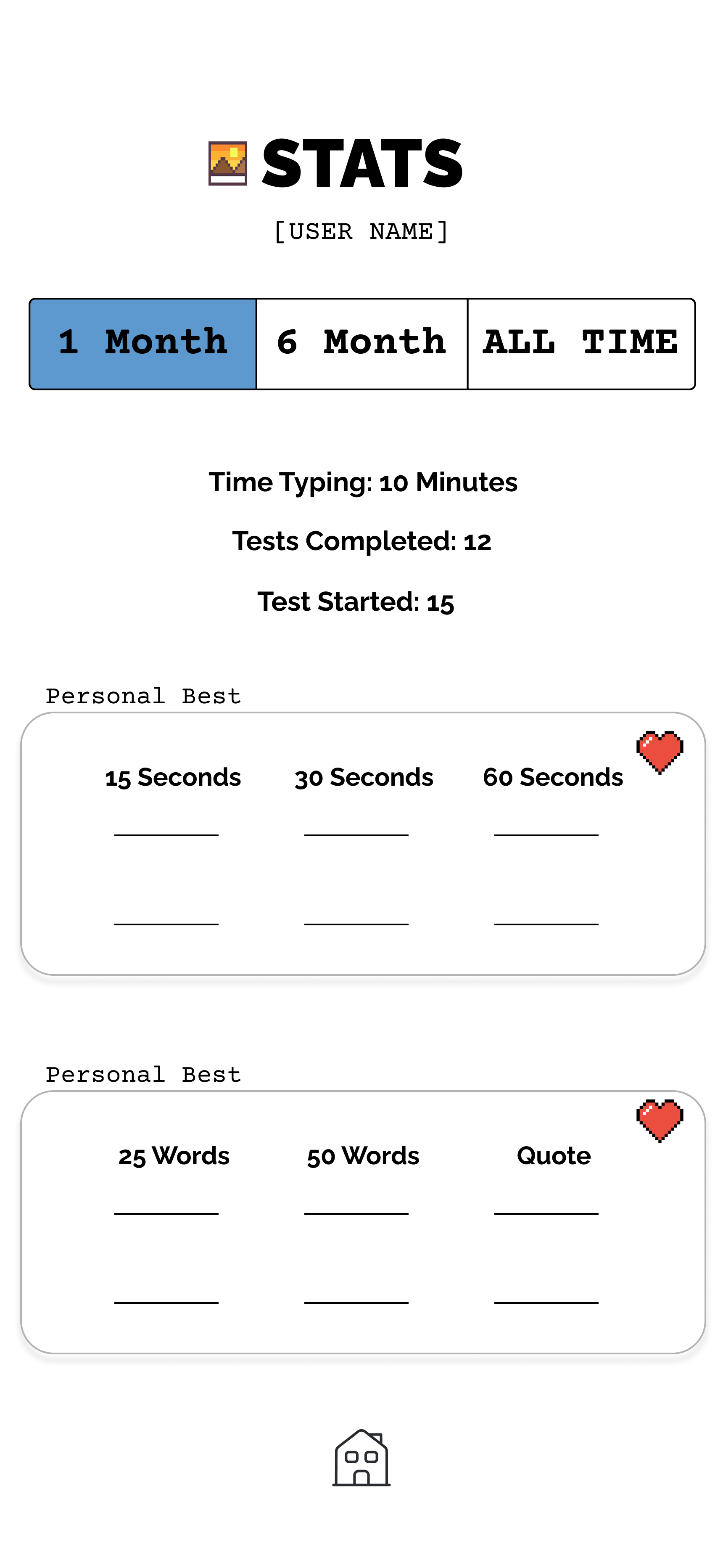
- Finding: Progress feels abstract and unrewarding. Design Response: Show concrete stats – WPM, accuracy, new words mastered – after each session.
Step 4: Incorporating competition and gaming
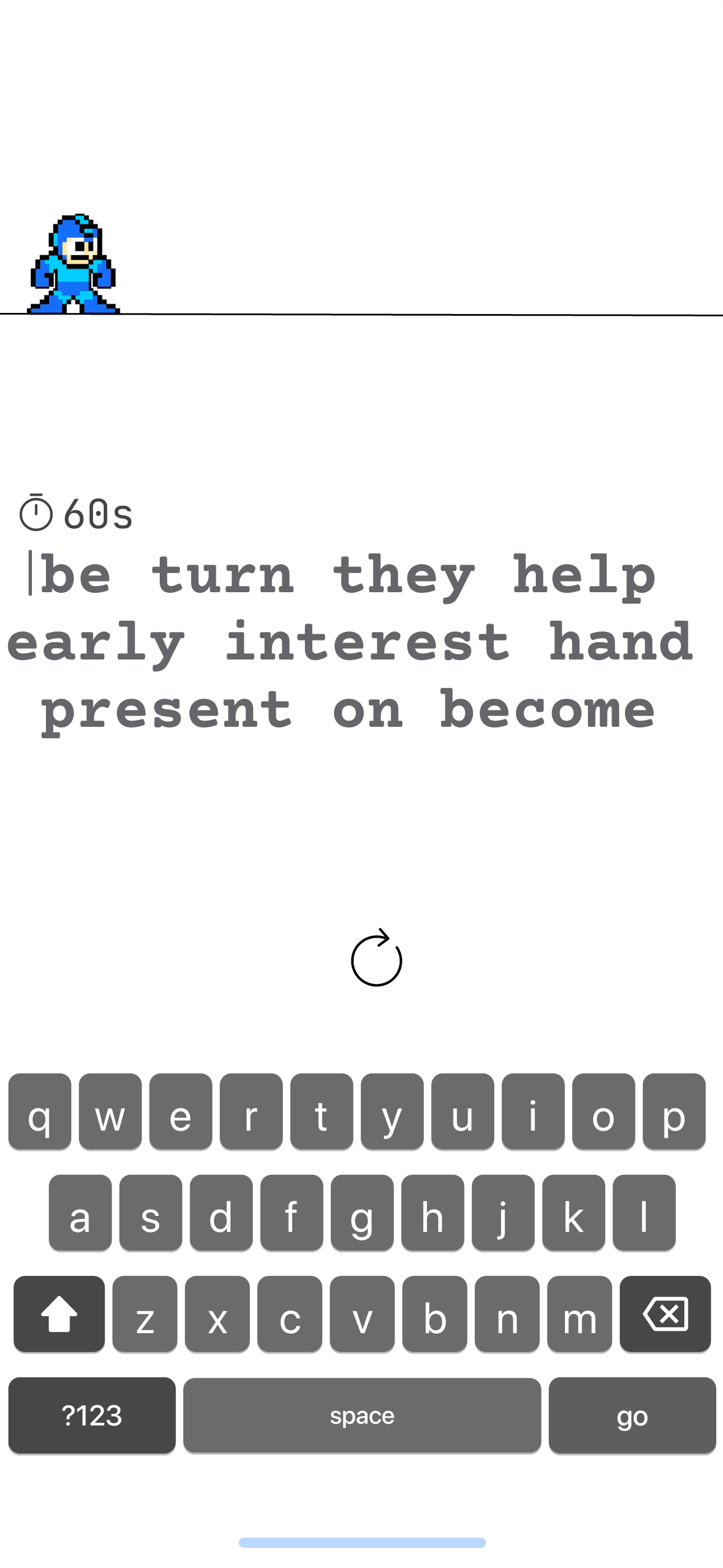
Pixel art gaming
I used Figma to design a prototype based on all my findings through research and initial ideation. The first prototype was incomplete but it clearly demonstrated what I want to do, make learning fun.
Step 5: Mapping the User Journey
Task Flow
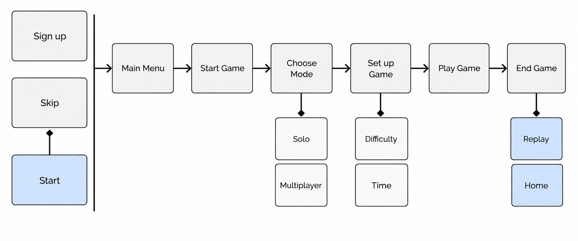
Task flow optimizes for:
Step 6: Prototype testing and improvement
Interactive Prototype Testing
4 interviews, 4 iterations.
.png)
Design evolution
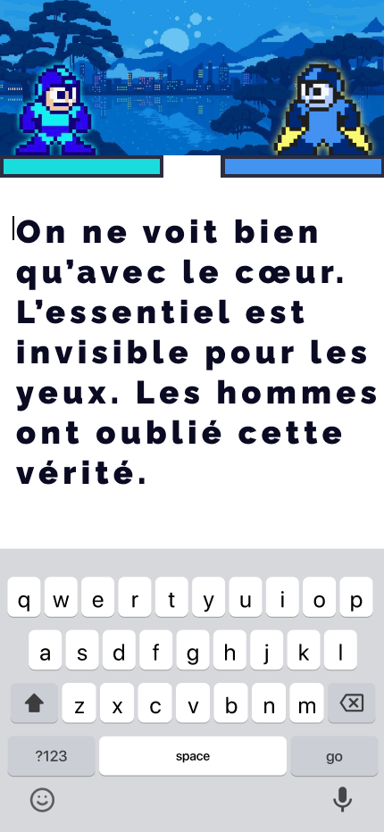
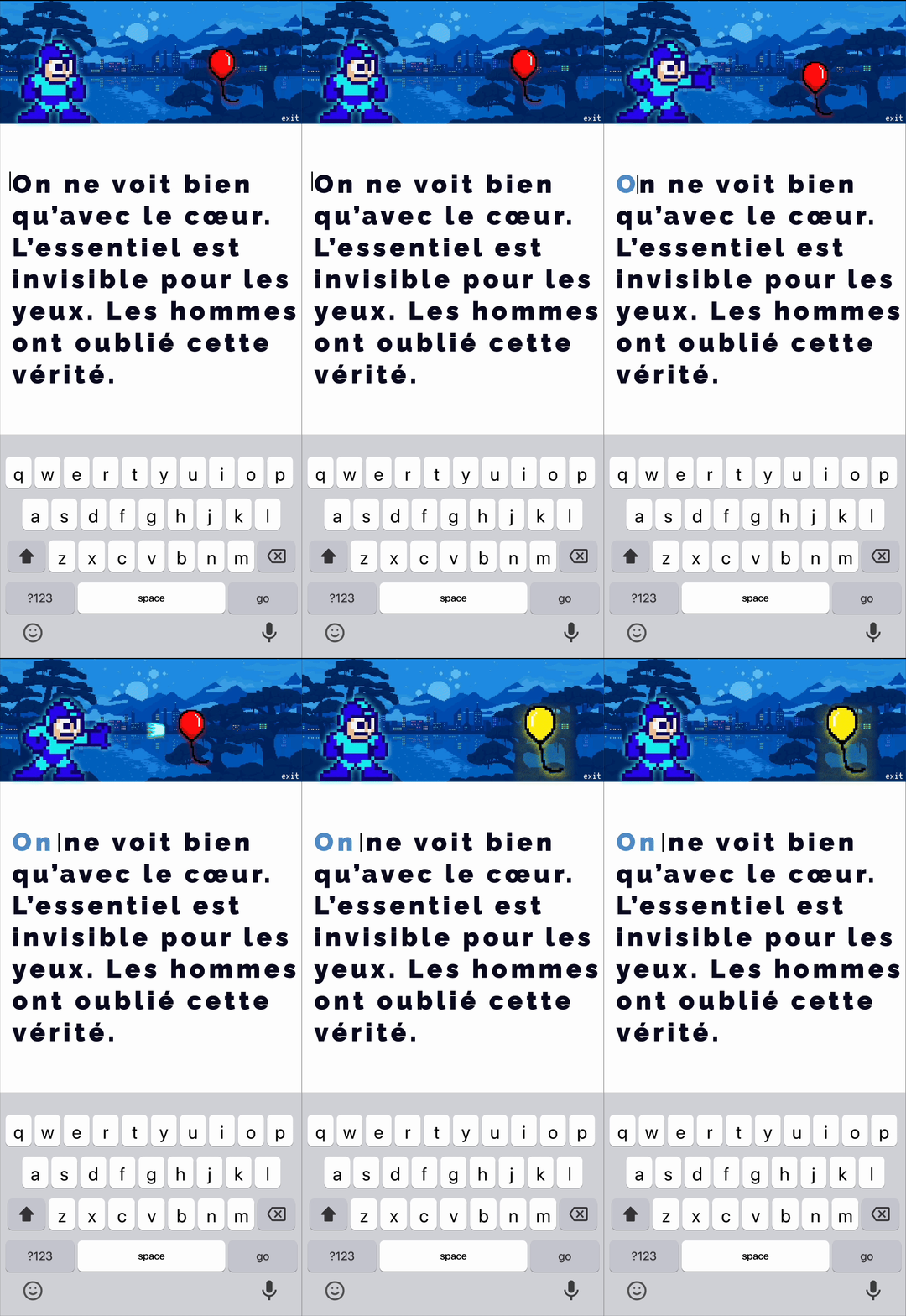
- Interview → iteration 1 insights: The first round of interviews validated the core concept. Participants found the Mega Man–inspired typing experience engaging, particularly those familiar with typing-based learning. However, users expected their typing to have a direct impact on gameplay, leading to the introduction of Mega Man shooting enemies in real time.
- Interview → iteration 2 insights: The second round of interviews tested the monster progression system. Participants found the Candy Crush–style progression confusing and felt it distracted from the core goal of language learning. The progression system was simplified to better align gameplay with learning.
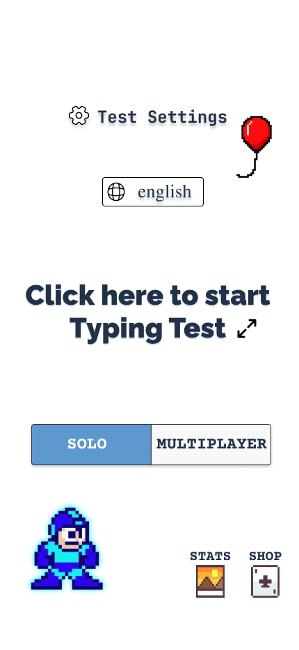
- Interview → iteration 3 insights: The third round of interviews introduced multiplayer mode and replaced the level-based progression with a simpler solo mode. Participants responded very positively to multiplayer, with many saying it was the feature they were most excited to use. Feedback also showed that the monster system still lacked engagement, prompting further refinement of the gameplay loop.
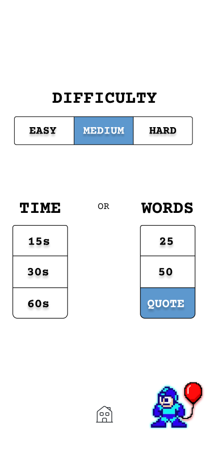
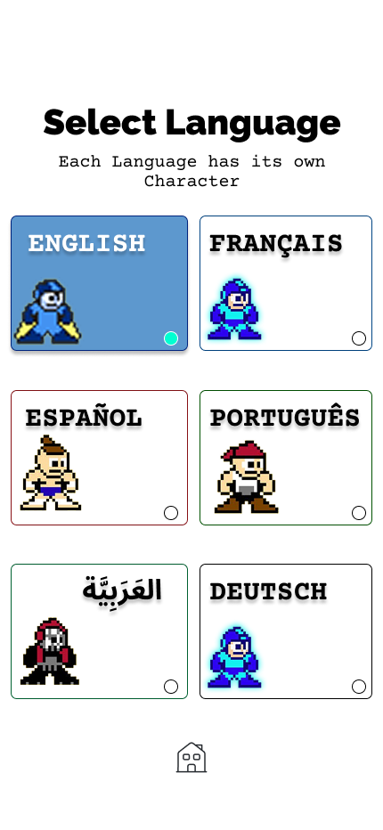
- Interview → iteration 4 insights: The fourth round of interviews evaluated a redesigned UI. Participants felt a fully retro aesthetic appealed to a niche audience, while a blend of modern and retro elements had broader appeal. The visual style was refined, replacing monsters with balloons to create a simpler interface and stronger brand identity.
Step 7: Testing shaped a series of deliberate design tradeoffs
Tradeoffs
Pixel-art aesthetic vs. clean minimal
Early prototypes tested as "clear but boring." The retro aesthetic was a deliberate risk — one that paid off by creating an emotional reaction and a sense of world that keeps users coming back.
Multiplayer focus vs. solo progression
A monster-battle system confused users about whether they were competing or progressing alone. Splitting into a clean solo mode and multiplayer mode made each mode's value immediately obvious.
Typing based loop vs. spaced repetition
Spaced repetition optimises for memory; I optimised for motivation. Users who drop off in week two never reach the long-term benefits of a rigorous system anyway. Engagement first, retention second.
Step 8: Trophy Mode for Visible Progress
Gaming at its core
Design Opportunity
To make progress feel meaningful, I introduced Trophy Mode in multiplayer—a system that transforms completed lessons into collectible achievements. Rather than simply increasing a percentage on a progress bar, each mastered lesson unlocks a unique trophy, creating a visual representation of the user's language-learning journey.
Final Design
-24.png)
-23.png)
-22.png)